2021-2022
New Designers Agency
Expert Review, UX Design, Gamification
UX Designer, Head of Gamification
The Hague archive contains loads of information that are meaningful to many curious residents. The current state of the website, however, was quite messy and needed a refresh. That's where my job began.
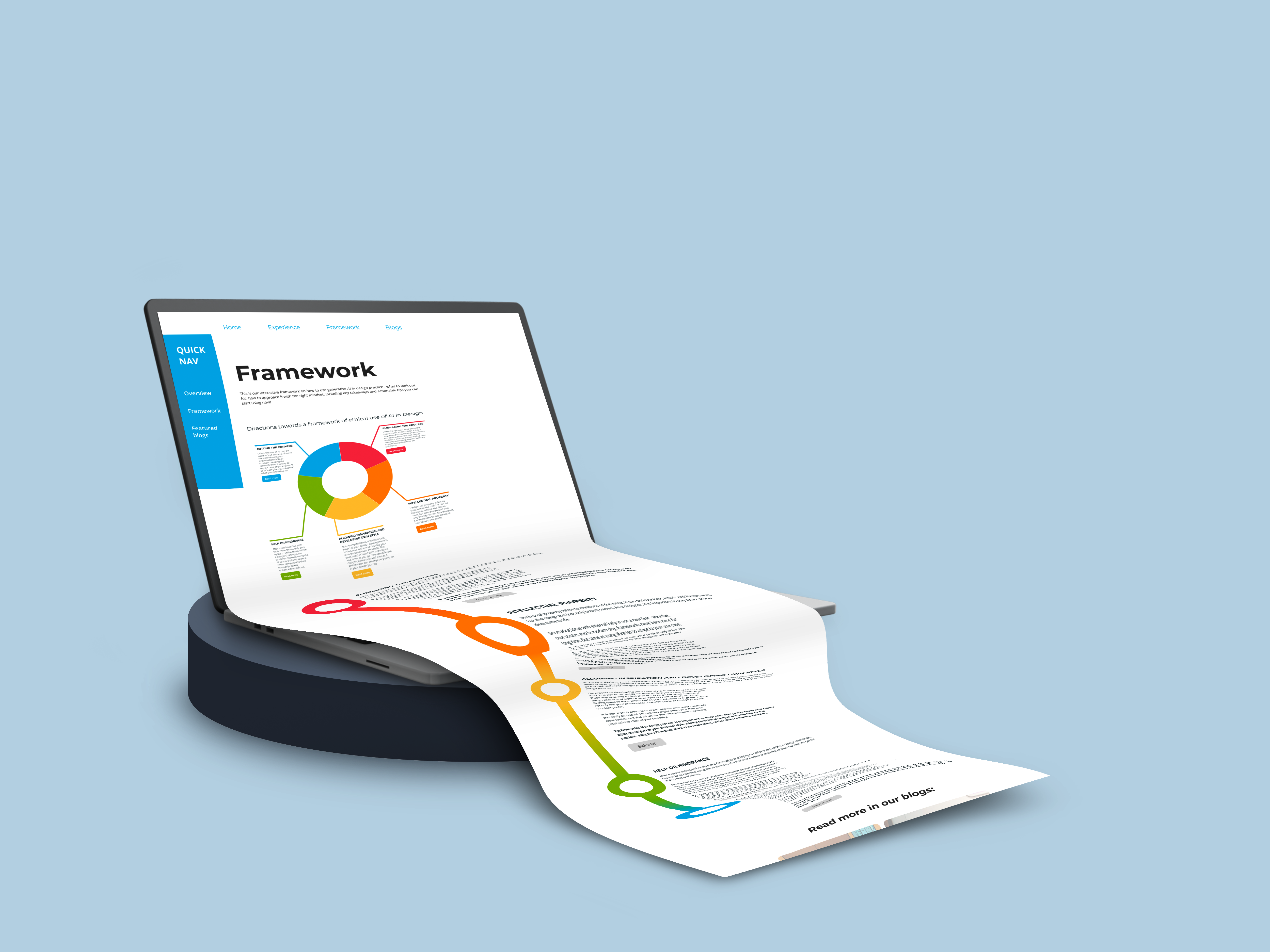
Create an overhaul plan of the website, with the focus on the "Project" page.
UX Designer
Gamification
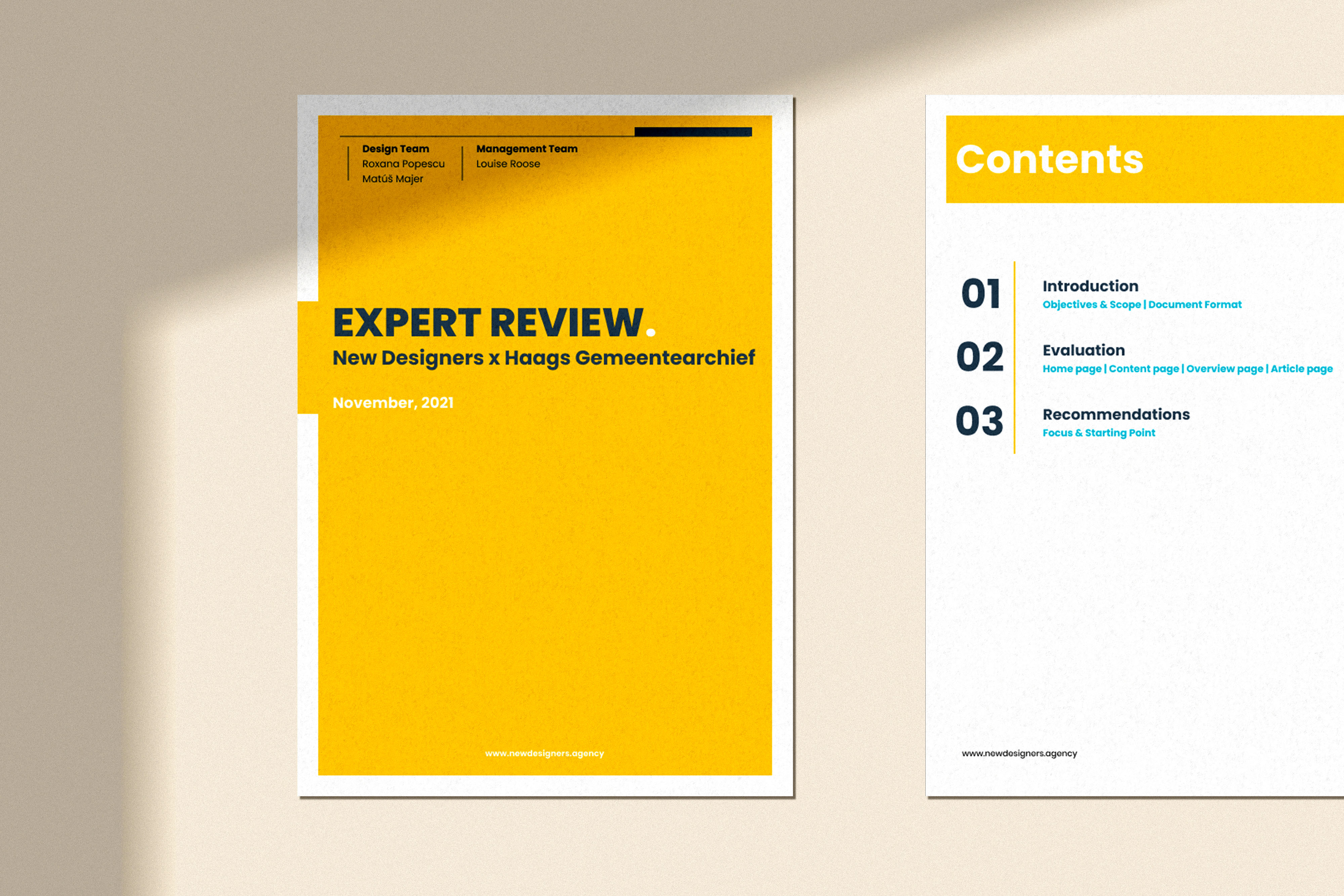
Expert review
To create a new scheme, the current one has to be analyzed. Someone designed that website with connections in mind that the new design should contain. That's why the first step was expert review, making sure we understand the scale and themes of the website.
In order to understand what needs to be changed and why a redesign is happening, we first dove into deep expert review and analyzed parts of website that disturb user flows, confuse users or also what features could be missing.
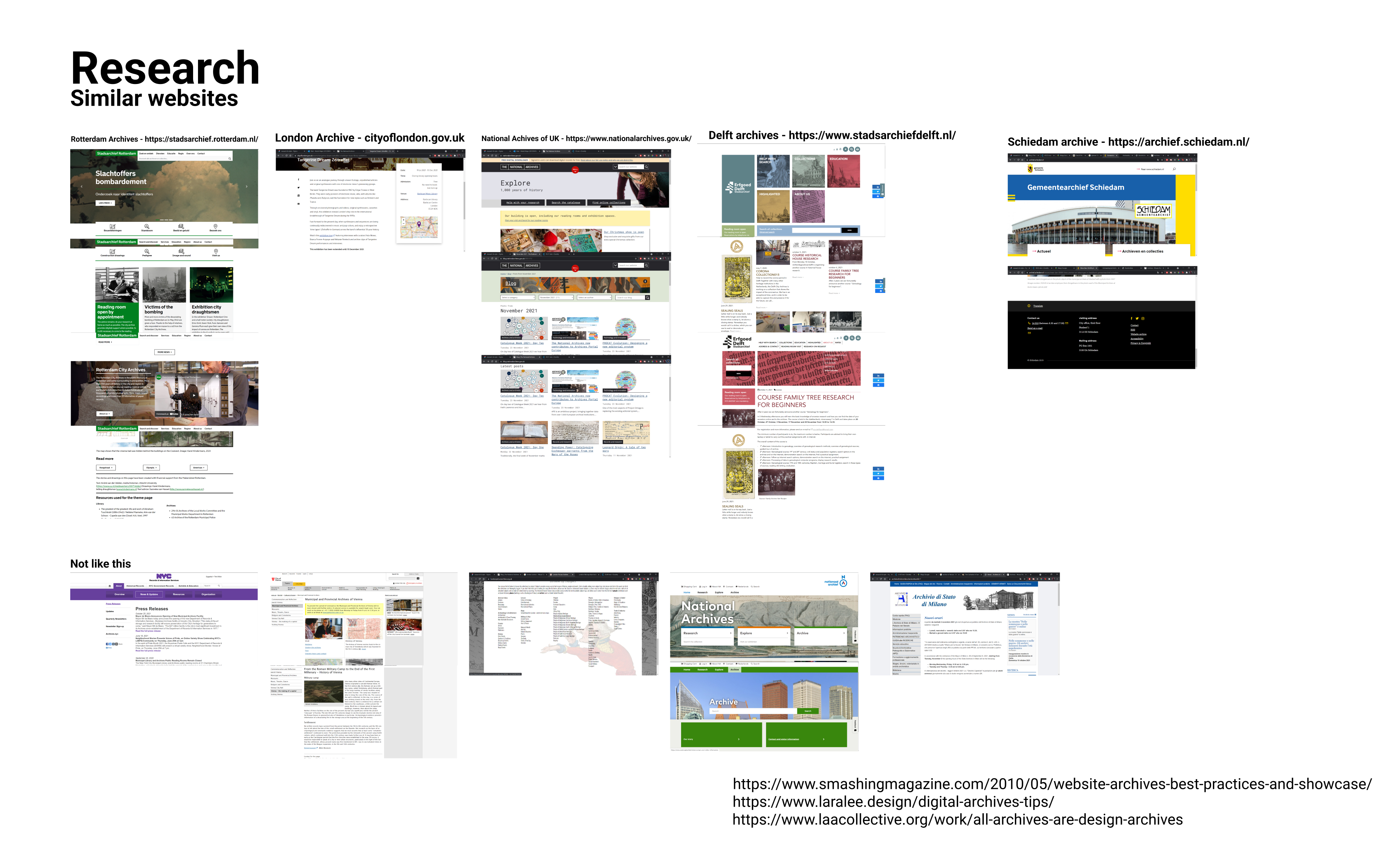
After understanding what's wrong with current design, we dove into identifying industry trends on how color, hierarchy and layout impacts complex article pages. We explored various archive pages within NL but also around the world, to see underlying themes and some of the "Do's and Don'ts".
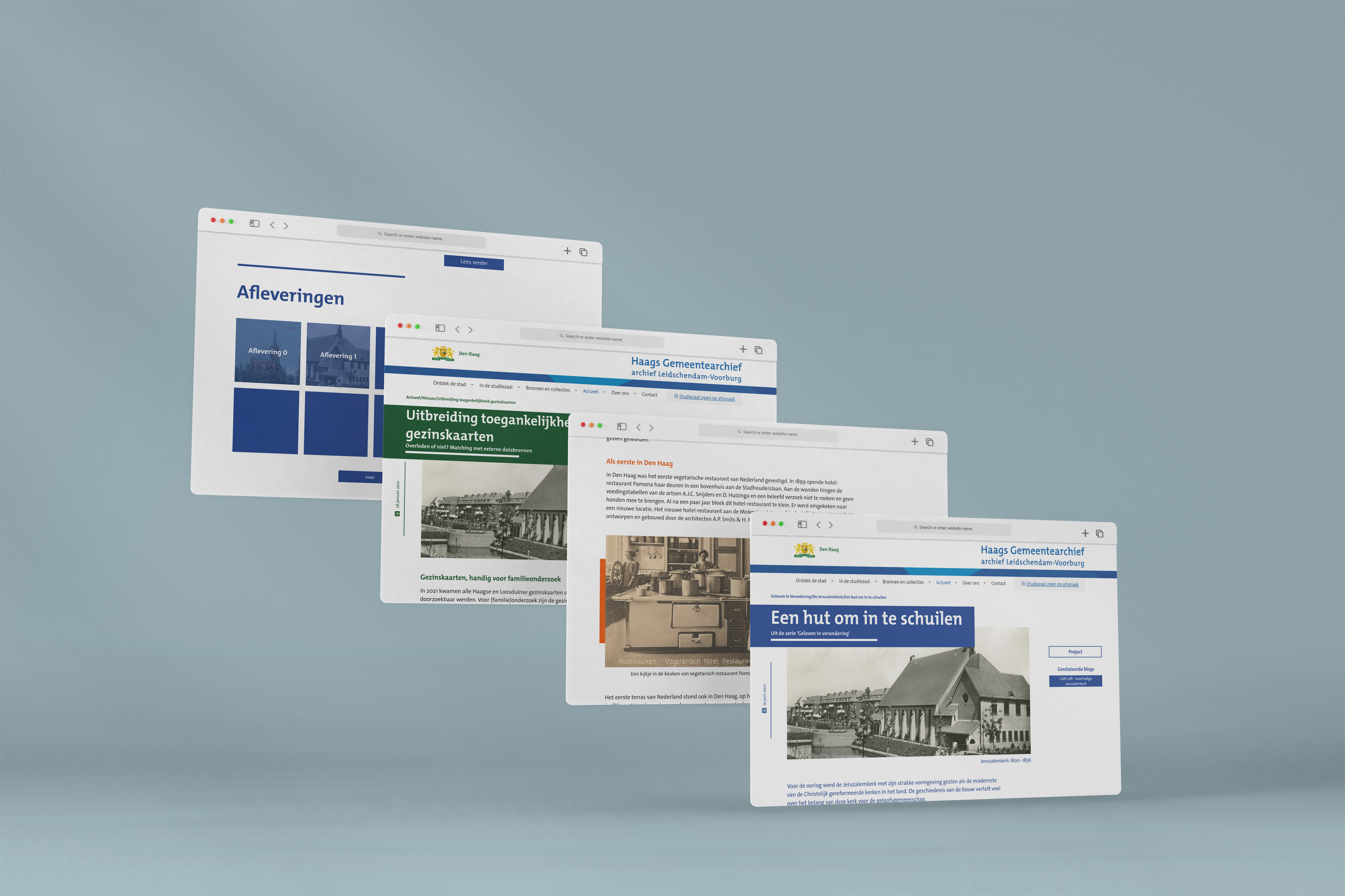
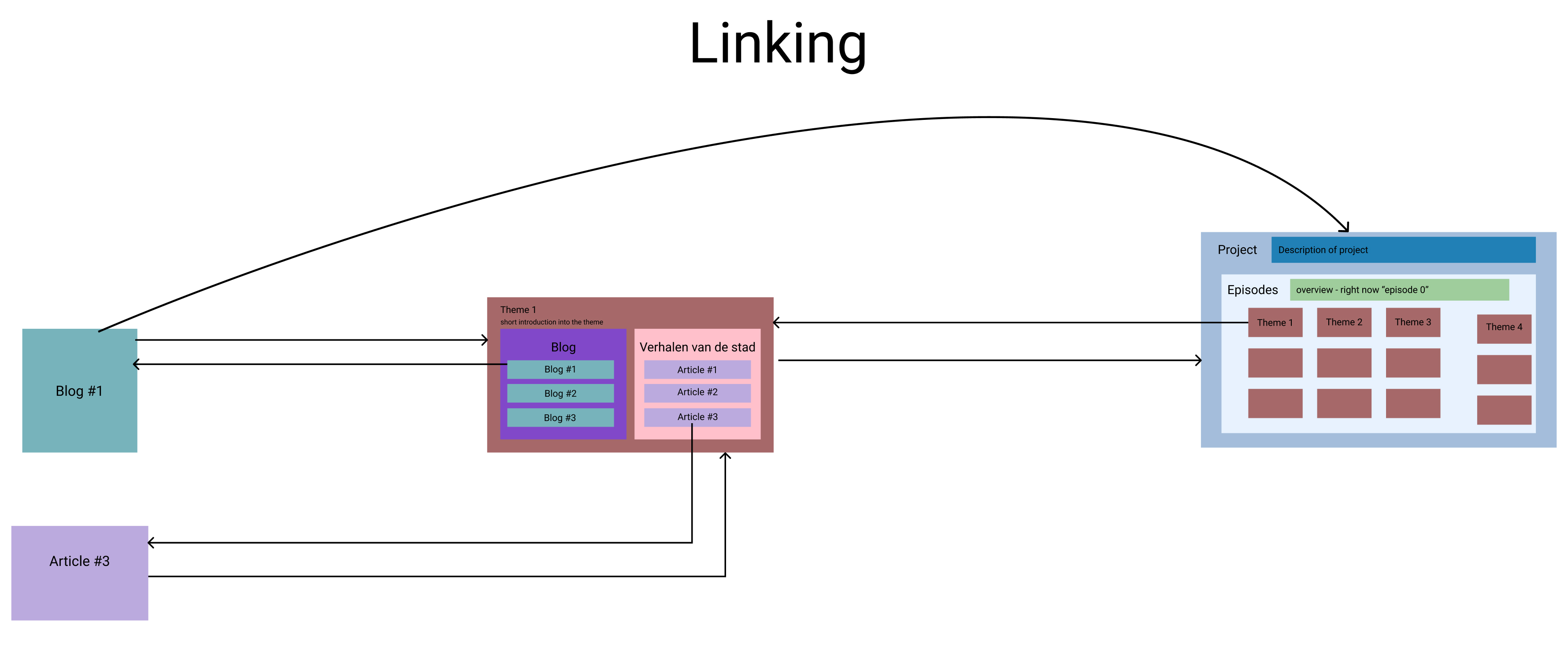
With a clear scope of the competitive landscape, we dived into creating the new structure of the website - to better link relevant pages together, and show how the individual articles link to the bigger projects.
01
Minimal linking possible
02
Show belonging within episodes (linking factual and personal stories together)
03
Keep the link of latest articles
To better communicate the new structure, a simple visual description was made.
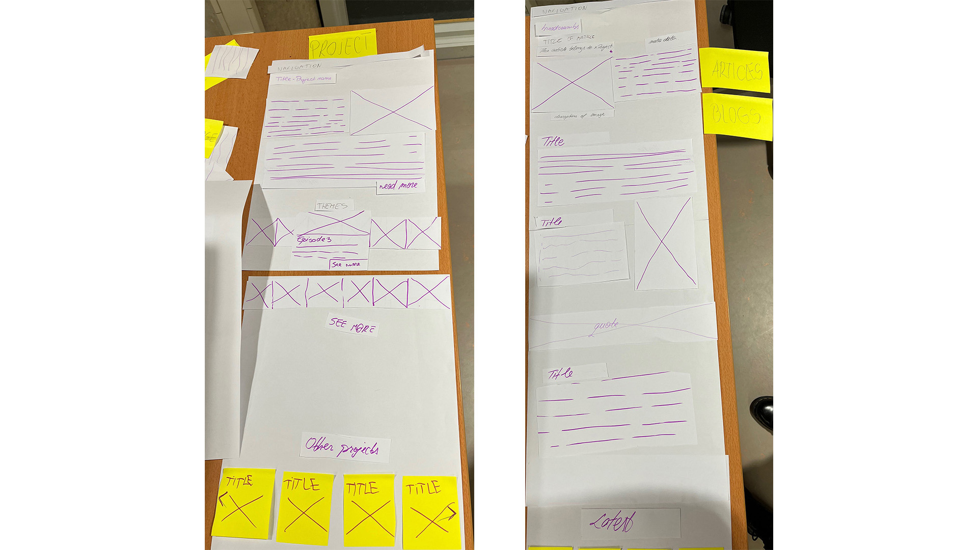
Once we had the structure of the page laid down, it was time to decide on the layout and interactions of the pages. That's why in the design team, we had a session for paper prototypes that we then translated to Lo-Fi prototypes.
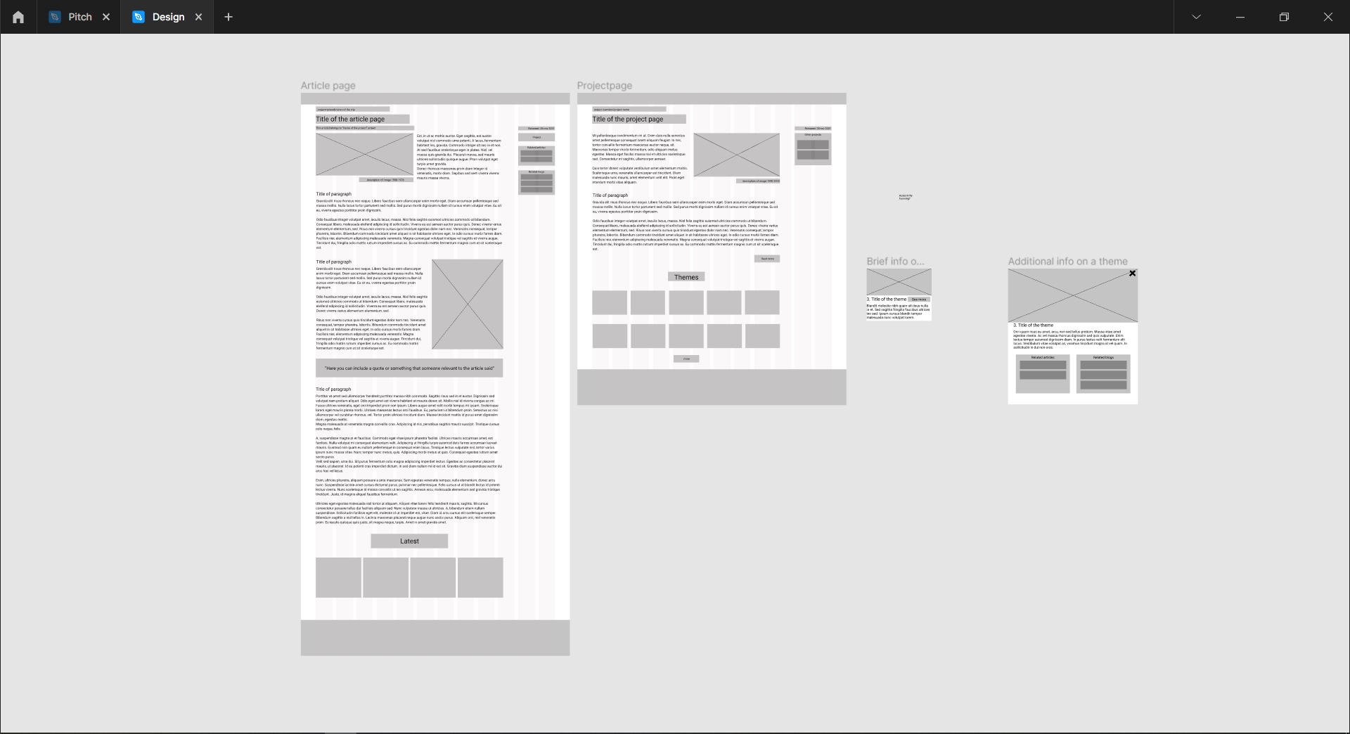


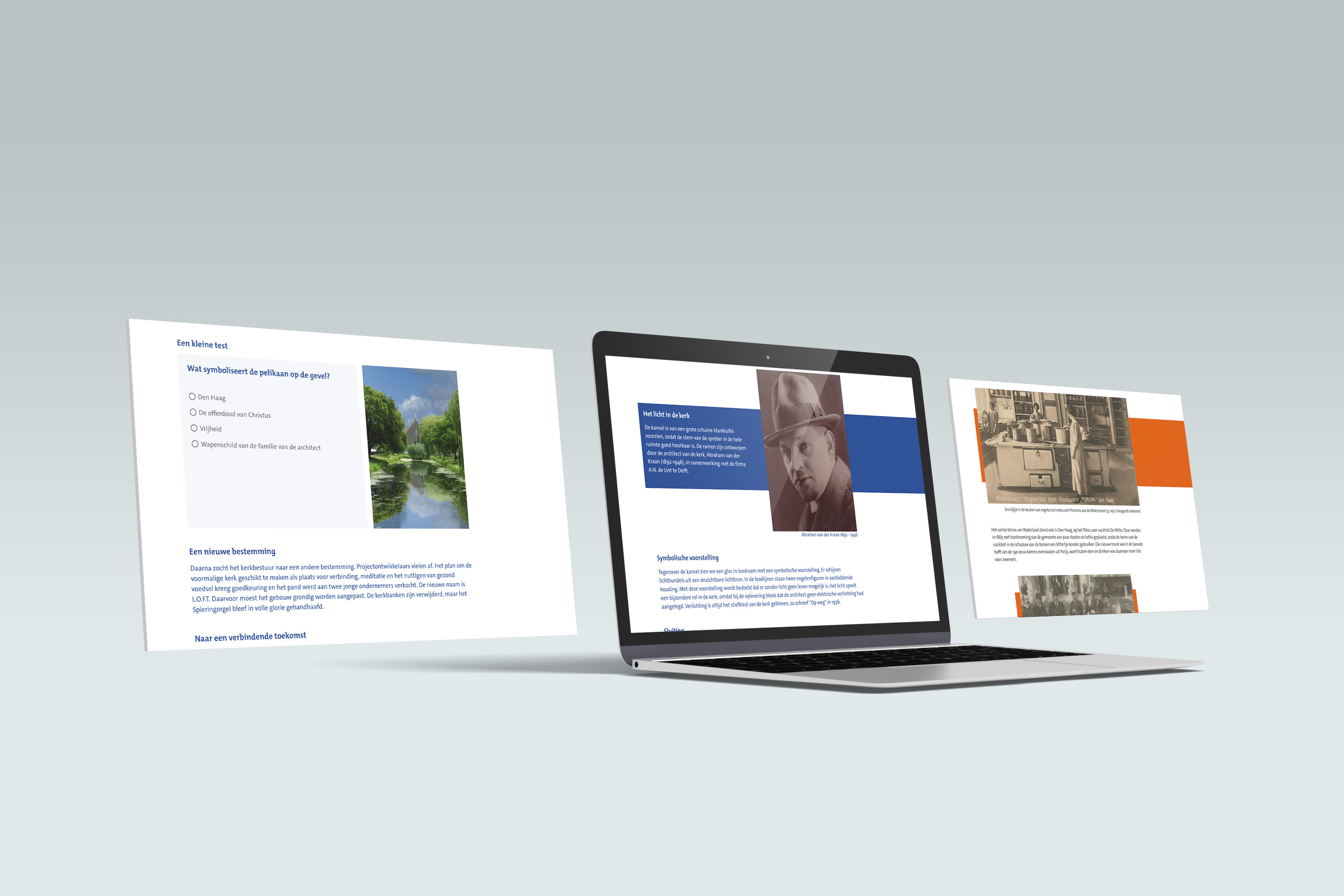
The final design aims to "make interesting content also look interesting". This design carries that out through gamification, as well as improved visual hierarchy, engagement and modern overhaul.
Centralized hub to view all episodes within a project, read about what connects them all and how it is structured, or find similar projects.
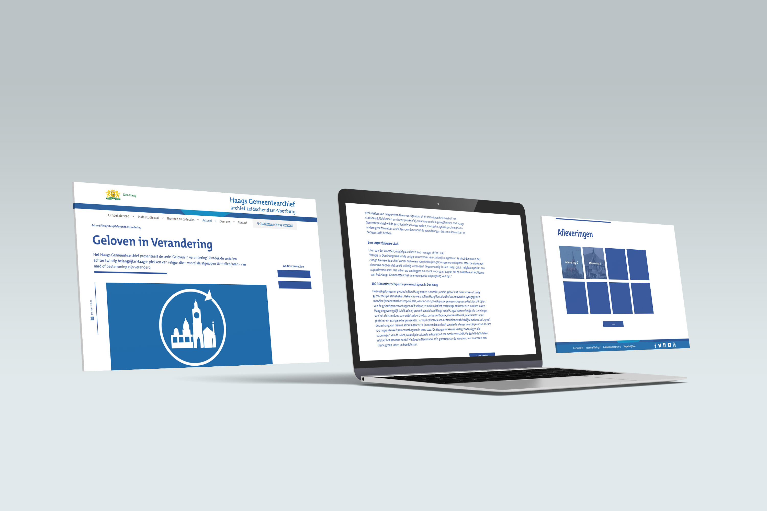
These pages are smaller, article pages that have gamification at the end to further engage the users.
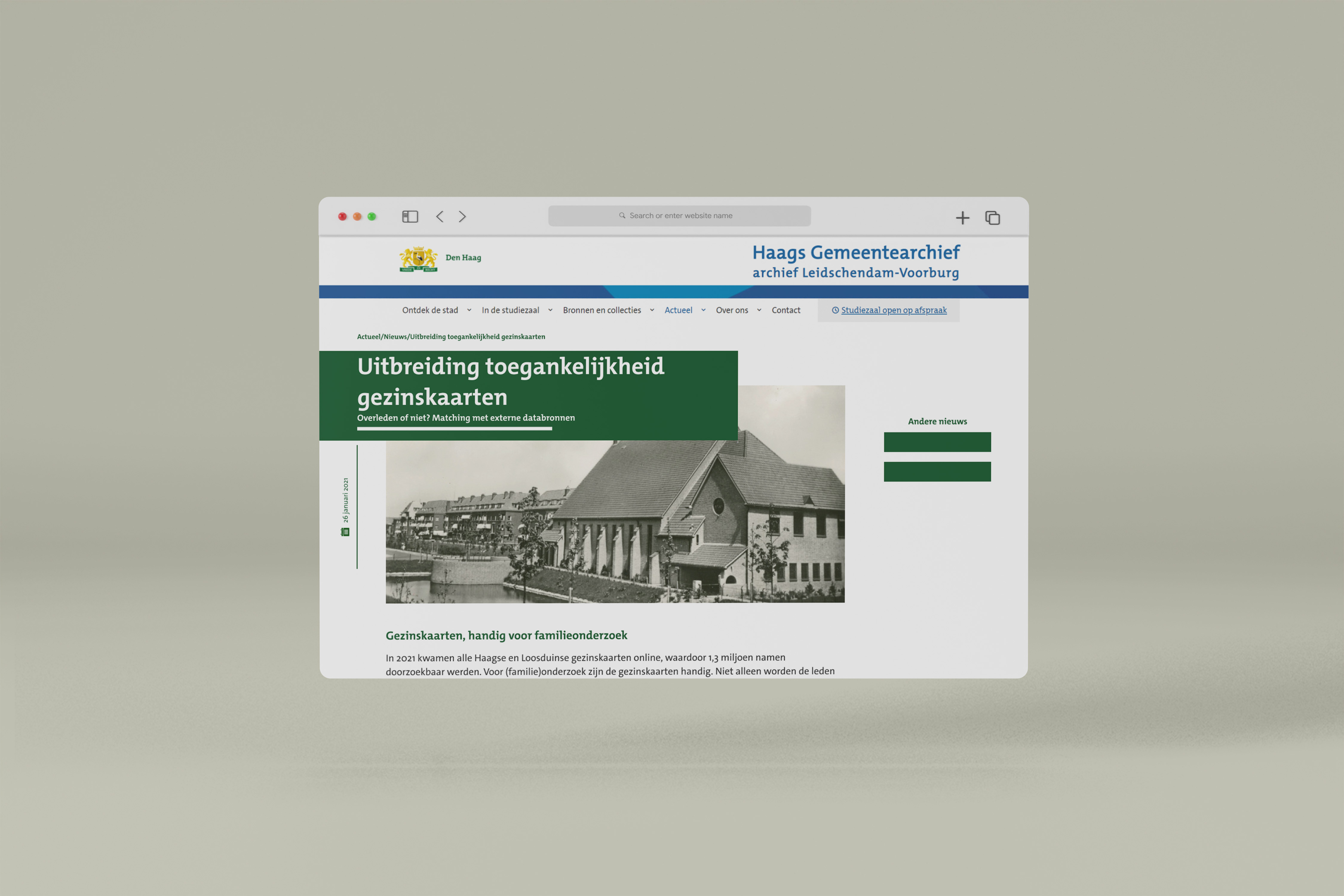
Though without gamification, this updated design of the News page bring better visual hierarchy and fresh look to the News posts.
Now that the design is done, the new projects of Haags Gemeentearchief will implement this design. The product team plans on following up with user testing to further iterate the design and validate design choices.